Last year, we revealed that the majority of mobile sites are still slow and bloated with too many elements, posing the threat of higher bounce rates and fewer conversions. Additional research from this study confirms that the number of images on a page is the second greatest predictor of conversions.
Optimising images is often the quickest and most impactful way to reduce page size and load time, which in turn will help to increase conversions and revenue. Here are some tips to help your company reap the benefits of image optimisation while ultimately creating a better experience for your users.
1. Prioritise first
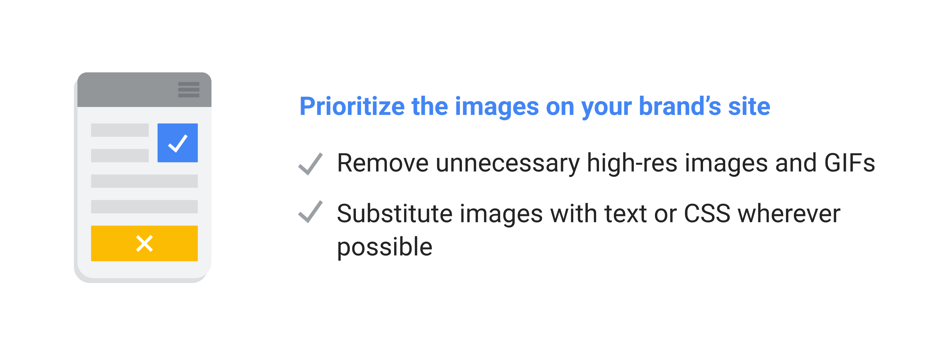
Before optimising the images on your site, consider whether they are all necessary. Sure, that high-res photo looks great but does it actually help to convey the message you are trying to get across? Can that animated GIF be simplified into a more efficient animation in purely code? Or better yet - removed completely?
Removing unnecessary assets reduces maintenance and complexity. And if an image can be substituted with text or CSS (cascading style sheets used to define styles, shapes, and effects in a few lines of code), then your developers will enjoy the creative challenge and your users will save on download size.
Alphabet’s Verily site is simple and lightweight due to their image reduction techniques. The hero section uses a cleverly animating gradient image of 1px wide. While the gradient could have also been created in code, this posed performance issues that were more costly and visually jarring. The designer and developer worked together to ensure the perfect balance between aesthetics and performance.
On mobile, this animation is even further simplified to a solid background colour which changes gradually in a coded sequence. The simplicity of these animations allows for this lightweight page without heavy JavaScript frameworks or excessive file sizes. Even when simulating a 3G network, the homepage achieves a near-instant load time and a Lighthouse Performance Score of 92. This is just a few milliseconds away from making it to the top percentile of high-performing sites.
2. Choose your format
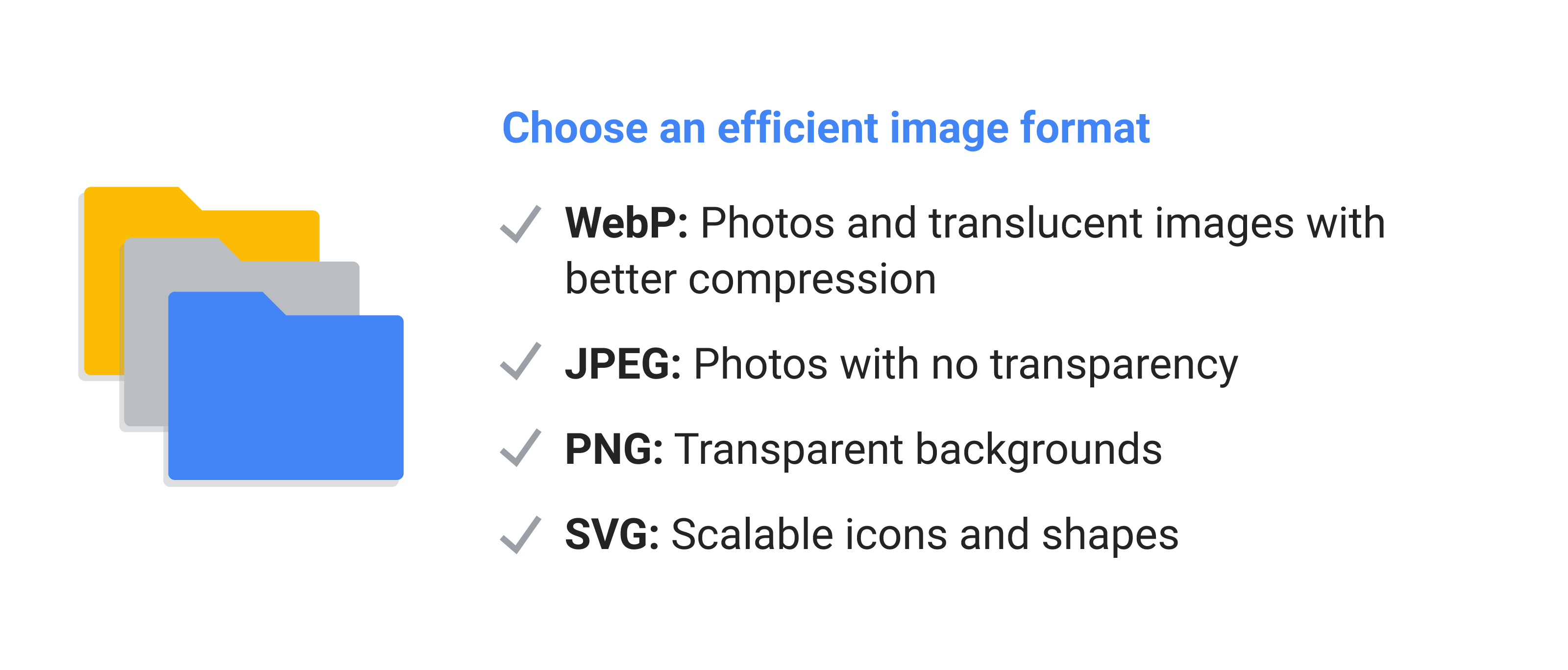
With so many different formats available, it can be difficult to know which one is the most efficient. It all depends on the use case, but choosing the correct format can already save some bytes from your page size. Aim to start with WebP, which can be used for photographic and translucent images at 30% more compression than JPEG, without loss of image quality. Then fallback to the following for full browser support:
- JPEG: Photos with no transparency
- PNG: Transparent backgrounds
- SVG: Scalable icons and shapes
On Google’s Fighting Piracy site, we use the SVG format to create smooth, lightweight animations made from simple shapes. Previous design concepts of this page included GIFs and videos of over 300KB each – that’s already twice the size of the entire full-page image optimisation guide attached.
However, by enforcing page weight budgets as part of their growing performance culture, the team was able to reduce image weights tenfold. This required a close technical collaboration with the developer and designer, but the mobile speed improvements were well worth the effort.
3. Compress & resize
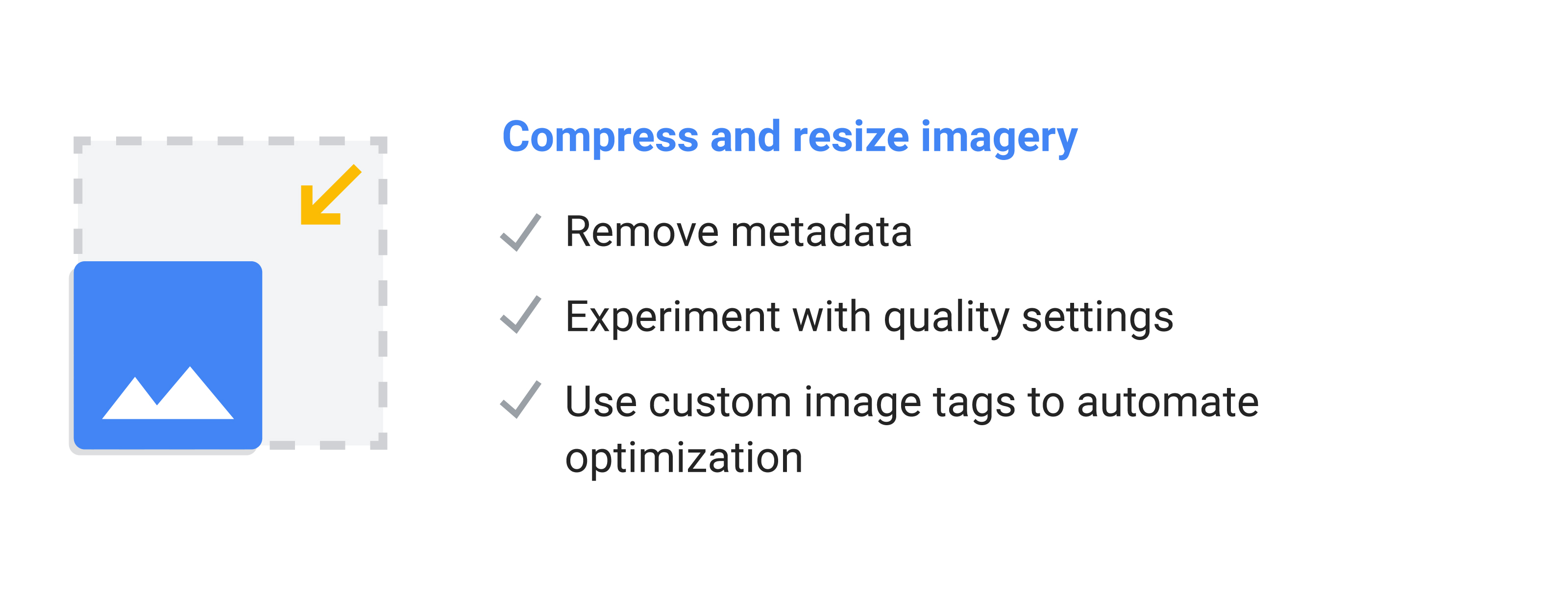
Optimising images can help you achieve the largest byte savings and performance improvements for your website. Even the most basic optimisations can help; compressing images, removing metadata (such as the date and time), and experimenting with quality settings. And now, it’s easier than ever to serve responsive images, as developers define multiple sizes of an image and the browser chooses the best fit for the user’s screen size.
Best of all, much of this can be automated to save time and ensure that images are always optimised. For instance, your hundreds or thousands of images could be resized and compressed automatically with a script. This reduces manual work from designers, freeing up time for more exciting work for them.
When building an Accelerated Mobile Page (AMP), the custom image tags make many of these same optimisations automatically. The Google AMP Cache also limits the maximum image dimensions to prevent browser memory issues and caches images for faster future loading.
In the case of BMW last year, the luxury car brand set out to create a high-performance, mobile-first approach while maintaining their beautiful images and videos. Thanks to AMP’s performant image tags and other speedy features, the new AMP site achieved a load time up to four times faster than before and an increase in mobile users by 50%. As a bonus, the website combine’s the speed of AMP with the rich features of Progressive Web App (PWA) technologies to offer a high-quality, app-like experience.
4. Use loading techniques
Compressing and resizing images is the basic approach that every designer and developer should enforce at a minimum. To go one step further, developers can conditionally serve different versions of the image based on the user’s device, screen size, or even the quality of their network conditions. In other words, your website can serve a smaller image for smaller screens and a more compressed image (or no image) for slower networks. This enables developers to build a fast-loading site for everyone, regardless of their unique browsing conditions.
Once your images are effectively optimised, you need to make sure that your images are delivered at the right moment. When users first land on your page, they want to instantly see all the content within their viewport--often referred to as “above-the-fold” content. With a technique called lazy loading, you can enable your webpage to prioritise loading the first available images in this limited view, while off-screen images are loaded at the moment of need.
Ecommerce company bücher.de only loads images if they enter the area visible to the user. They prioritise the content in the visible portion of the page so it loads instantly. Through this, and other page optimisations, they were able to speed up their site by 33% and reduce load time to 3.5 seconds.
When images take longer to load, it’s useful to implement progressive loading techniques like placeholders, progress indicators, or efficient formats like progressive JPEG. This at least gives users the feeling that progress is being made, and will keep them engaged on the site longer. As Designer Advocate Mustafa Kurtuldu, says: “The idea is to fill the space and occupy your time.”
Next steps: Make speed a KPI
Optimising images is a simple and cost-effective way to improve conversion rates. But in order to make speed optimisation long-term sustainable, you need to ensure site speed is a KPI across your organisation.
The four techniques in this guide will help you speed up your sites today, but it’s up to your company to create a performance culture that will last.


